Typography Guidelines in Human Interfaces §
- With variety of device dimensions and display densities it is important to maintain a minimum font size that most people can read easily.
- Font weight, size, and colour can be adjusted to emphasise important information and help visualise hierarchy.
- Mixing too many different typefaces can obscure the information hierarchy and hinder readability, therefore minimise the number of typefaces you use in your interface
Minimum Font Size §
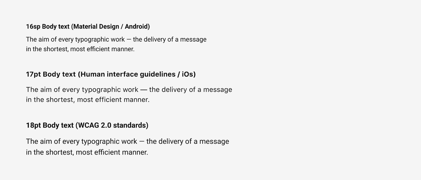
- Apple recommends setting the minimum size for body text to be 17pt
- Google’s guidelines specify setting the body text to 16pt
- WCAG 2.0 standards recommend following the minimum font size of 18pt and 14pt for Bold text.
Headline Size §
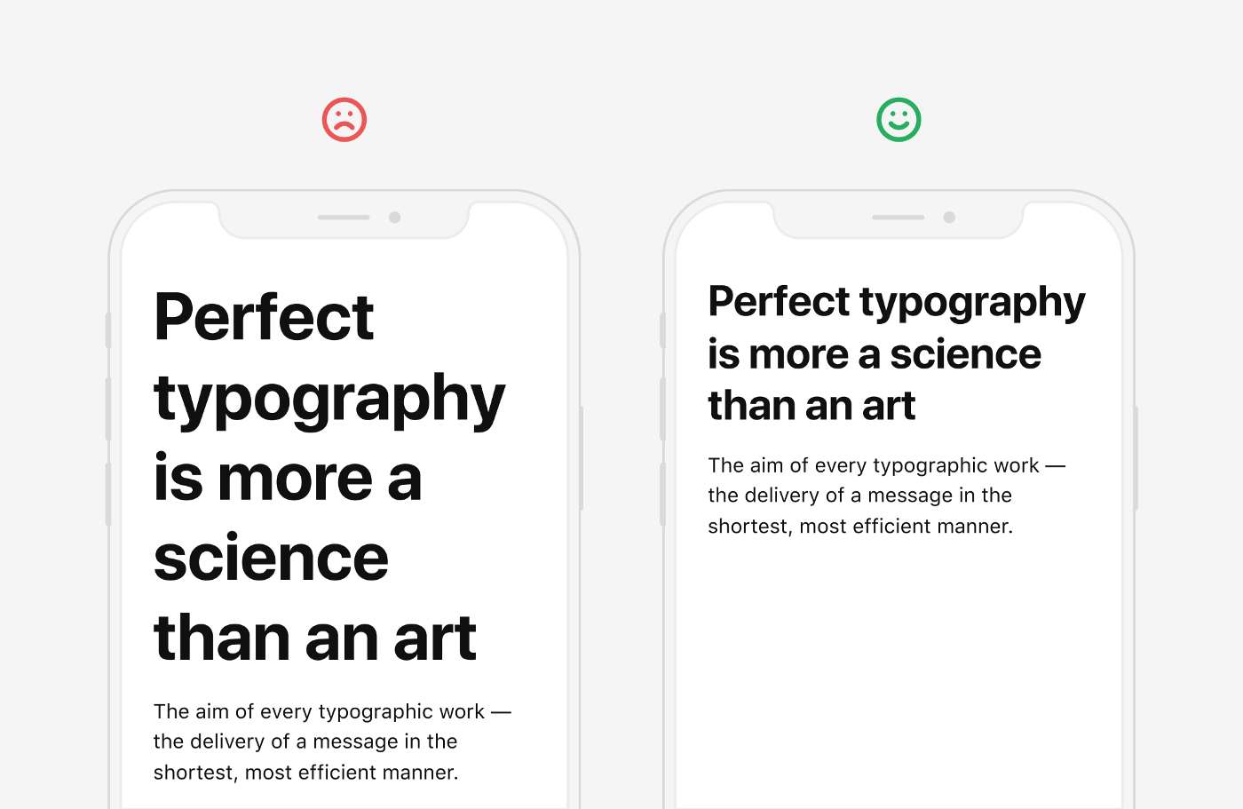
- You need to be very careful when using large headers in the mobile apps. Often the use of a large size for headings in mobile apps results in the fact that a headline is stretched to 3–4 lines while contains 1 or 2 words per line. Such headers look messy and are hard to read.
- Choose a headline size both contrasting with the body text and fitting on average 2–3 lines.
Contrast §
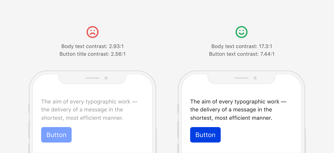
- Follow WCAG 2.0 Contrast Standards
- Make sure that the text you place over images has a sufficient contrast
- Provide two options for placing text on a light and a dark background
Whitespace §
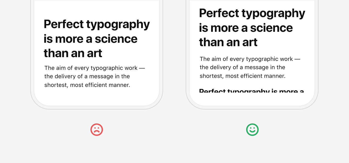
- Mobile devices have a very limited screen size, so you will want to fit as much text as possible within a single visible screen.
- You don’t have to sacrifice whitespace to do this by reducing margins between text blocks. This will break the hierarchy between different text styles and blocks and will make the text harder to read.