 Typography is a word which derived from the Greek words typos meaning “form” or “impression” and graphia meaning “writing”, it originates from the first punches and dies used to make currency in ancient times which ties it to the history of printing.
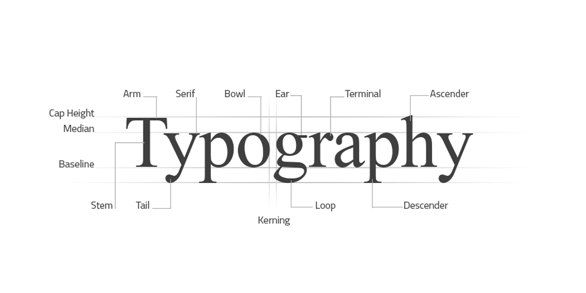
It is the art and technique of arranging letters and text in a way that makes the copy legible, clear, and visually appealing to the reader through the use of font styles, appearance, and structure combinations which aim to elicit certain emotions and convey specific messages bringing text to life.
The arrangement of type involves selecting typefaces, Point Sizes, Line Lengths, Leading, Tracking, and Kerning
History
- The somewhat modern understanding of typography can be dated back to the 11th century (#timeline/ce11 ) during the innovation of movable type, prior to the modern digital age, typography was a specialised craft associated with books and public works.
- The modern lead-based moveable type (along with the mechanical Printing Press) is attributed to Johannes Guttenberg (#timeline/ce15 ) where his type pieces made from a lead-based alloy, suited printing purposes so well that the alloy is still used today.
- Guttenberg developed specialised techniques for casting and combining cheap copies of letter punches in vast quantities required to print multiple copies of texts.
- His breakthroughs were instrumental in starting the Printing Revolution and the first book printed with lead-based movable type was the Gutenberg Bible.
Distinction of Terms
- A typeface is a particular set of glyphs or sorts (an alphabet and its corresponding accessories such as numerals and punctuation) that share a common design.
- For example, Helvetica is a well known typeface. A font is a particular set of glyphs within a typeface. So, 12 point Helvetica is a font, and 10 point Helvetica is a separate font.
- The same goes for different weights – a 14 point Helvetica Bold is a different font than a 14 pt Helvetica Light. They are different fonts, but the same typeface.
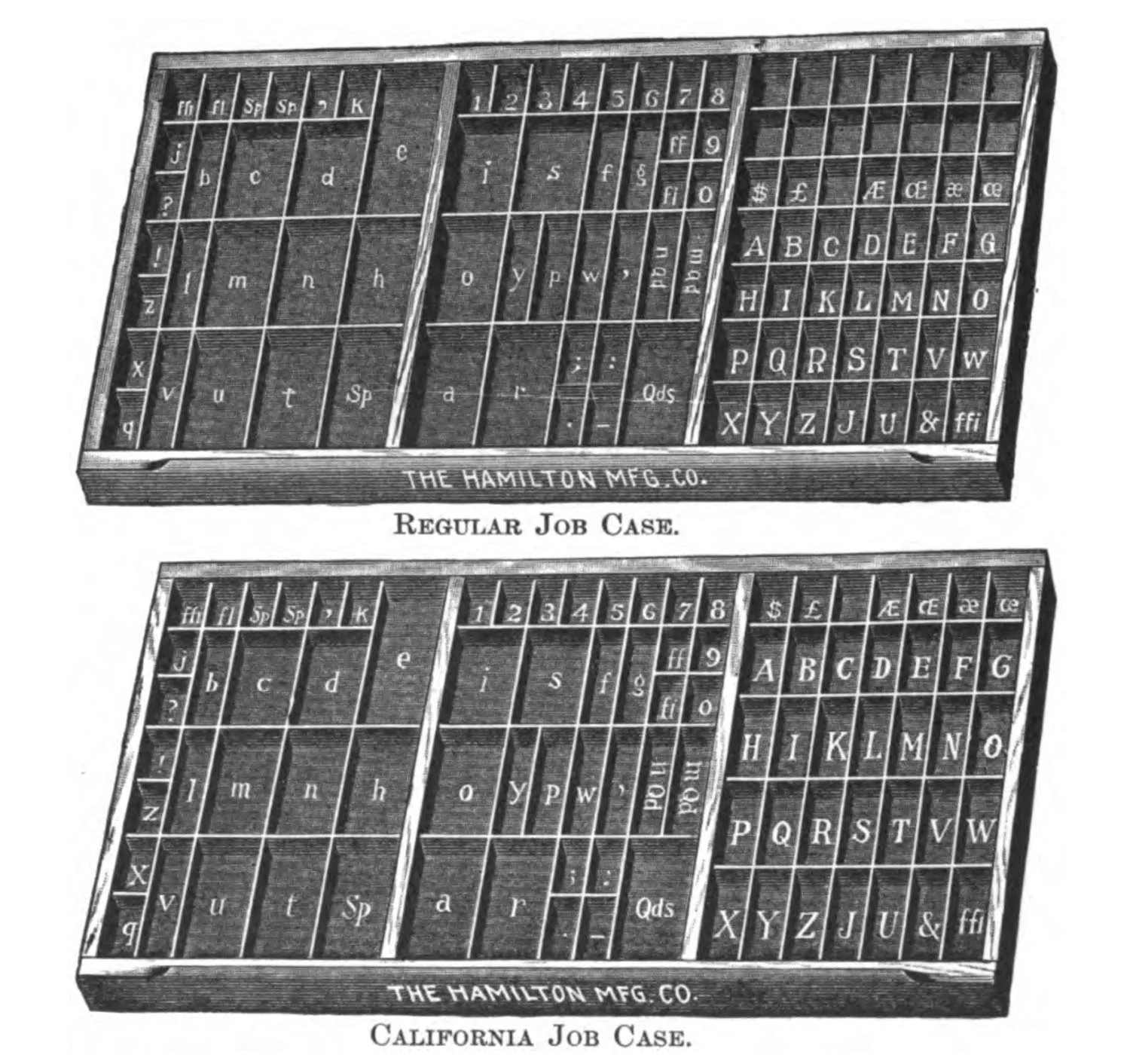
- The reason for this distinction isn’t as important today as it was historically when a page of text was set by hand before printing, and meticulous organisation of thousands of small pieces of metal was essential. For centuries, a printer or typesetter would set type letter by letter from a type case.
- The type was stored in shallow wooden drawers, called job cases, that were divided into small compartments for each letter, numeral, ligature, punctuation mark, and varying widths of spacing.
- Older styles of type cases organised the capital letters in a separate case from the minuscules. The capital letter case was placed above the drawer of minuscules, which is where we get the terms “uppercase” and “lowercase.”
Evolution
- The design of typefaces has developed alongside the development of typesetting systems. Although typography has evolved significantly from its origins, it is a largely conservative art that tends to cleave closely to tradition. This is because legibility is paramount, and so the typefaces that are the most readable usually are retained.
Modern Considerations
- Typography is much more than choosing beautiful fonts, over the years it has become a vital component of User Interface Design
- Good typography establishes a strong Visual Hierarchy, provides graphic balance, and sets the overall tone.
- It can guide and inform users, optimise readability and accessibility, and ensure an excellent user experience.